Story
 February 18, 2026
3 Charts To Better Understand the Potential Link Between Pesticides and Cancer
Country:

Project
Toxic Fields
This project will explore the link between widespread pesticide usage and cancer, how pesticide...
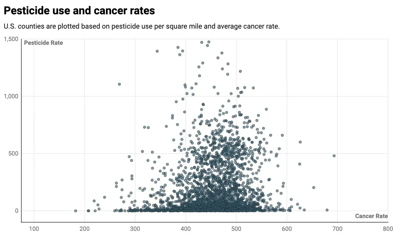
Most counties with the highest pesticide use also have cancer rates above the national average.
A majority of the top pesticide-using counties in the U.S. have cancer rates above the national average.
For years, pesticide users have claimed agrichemicals have caused cancer, along with other health complications. Courts have agreed, ruling against pesticide manufacturers multiple times.
Several scientific studies have also found links between cancer and pesticides, which can drift through the air or run off into nearby rivers and streams.

As a nonprofit journalism organization, we depend on your support to fund more than 170 reporting projects every year on critical global and local issues. Donate any amount today to become a Pulitzer Center Champion and receive exclusive benefits!
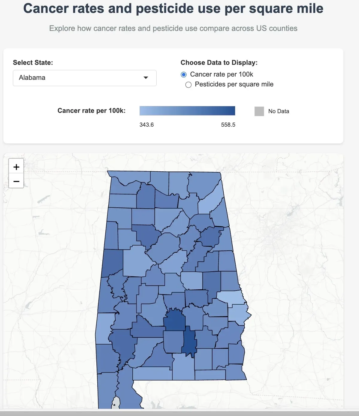
Click here to access the following interactive map:
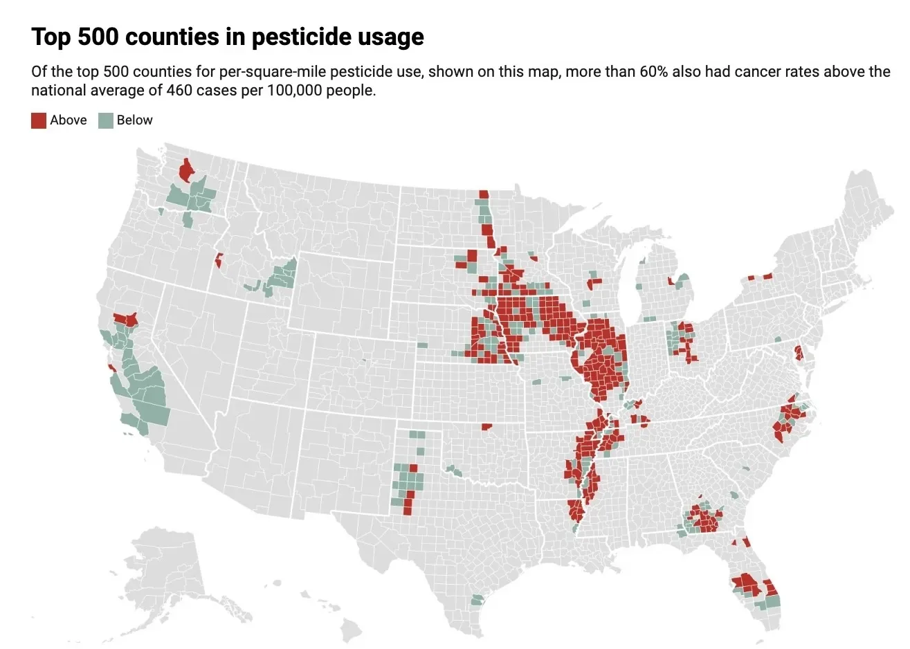
While investigating this potential link, Investigate Midwest, as part of a reporting partnership with the Pulitzer Center’s StoryReach U.S. Fellowship, analyzed data on the top 500 U.S. counties by per-square-mile pesticide use. More than 60% of those counties also had cancer rates higher than the national average.
Most of these counties are in the heartland, especially in Iowa, Illinois and in the agricultural regions along the Mississippi River.
Click here to access the following interactive graphic:
Click here to access the following interactive graphic: