Resource April 7, 2016

Telling Science Stories: Data Visualization

Authors:
Media file: screen_shot_2014-10-02_at_1.36.57_pm.jpg
English

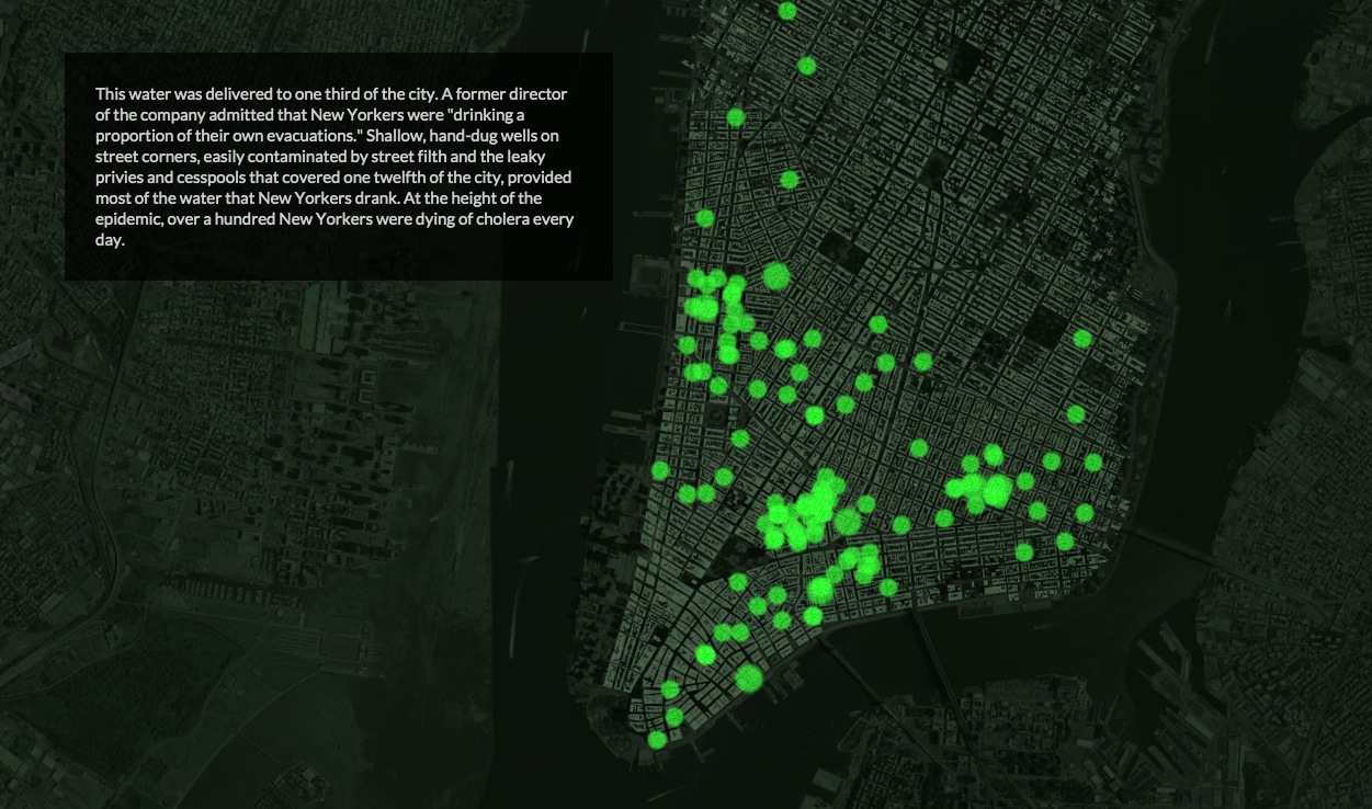
The cholera epidemic that hit Haiti four years ago bears some startling resemblances to one that...

SECTIONS
Media file: mapping_cholera.jpg
Cholera: A Tale of Two Cities

This video interview was developed specifically for our Global Health Lesson Builder Initiative. View, use, or adapt the full lesson here.

Grantee Dan McCarey says great data visualization must be honest, aesthetically pleasing, insightful and interactive. He says data visuals help viewers understand complex data.

RELATED TOPICS

yellow halftone illustration of an elephant

Topic

Environment and Climate Change

Environment and Climate Change
navy halftone illustration of a boy carrying two heavy buckets

Topic

Water and Sanitation

Water and Sanitation

RELATED CONTENT